Continue down memory lane with me as we look back at the campaign signs for Howard County local elections in 2010. (For more signs see part 1 and part 3, and note that I didn’t make a complete record of all signs.)
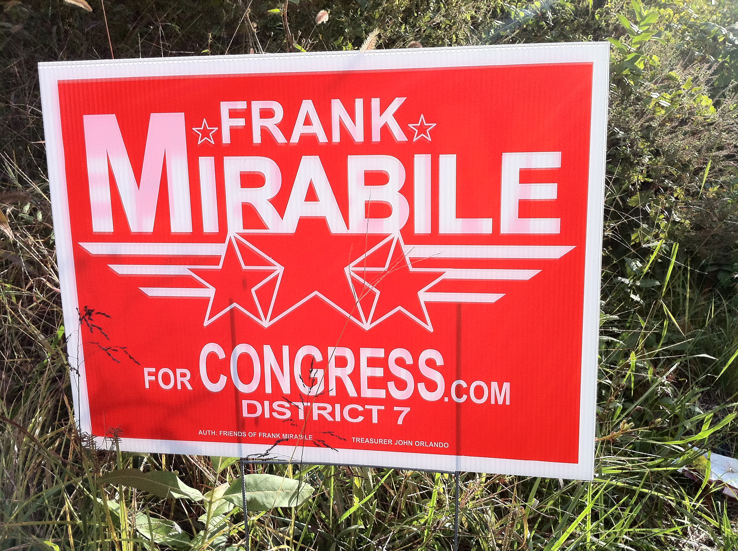
Frank Mirabile for US Congress (2010)
Based on the sign it appears that Frank Mirabile’s campaign website had (has?) a very long domain name; was frankmirabile.com taken? The stars are an interesting design element, but the middle and largest star looks somewhat chopped off.

Trent Kittleman for County Executive (2010)
One of several signs to use combinations of the colors in Maryland’s state flag: red, white, black, and gold. This one is unusual in attempting to use all four at once (if we count the thin white border). Note that in the actual Maryland flag the red and white elements are visually separated from the black and gold elements, and in particular there is minimal juxtaposition of red and gold.
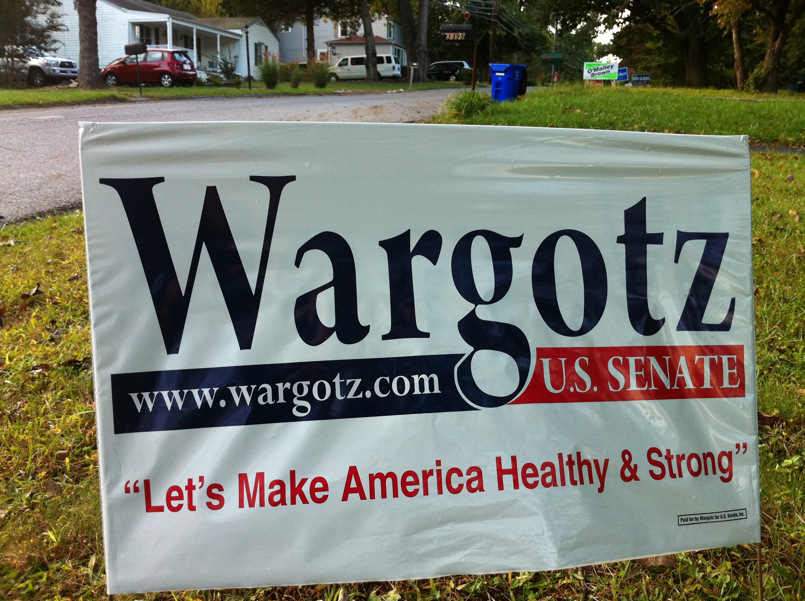
Eric Wargotz for US Senate (2010)
There’s a lot to like about this sign, including the nice intrusion of the descender of the letter “g” into the middle design element. It might have been improved by ditching the slogan (who has time to read slogans at 30-40 mph?) and the domain name and bringing “US Senate” into the bottom half of the sign, leaving the middle red and blue elements plain. (P.S. Yes, I know that this wasn’t strictly speaking a “local” election.)

Allan Kittleman for State Senate (2010)
Presumably whoever designed this sign believed that when voters saw “Kittleman” they’d think “Allan.”
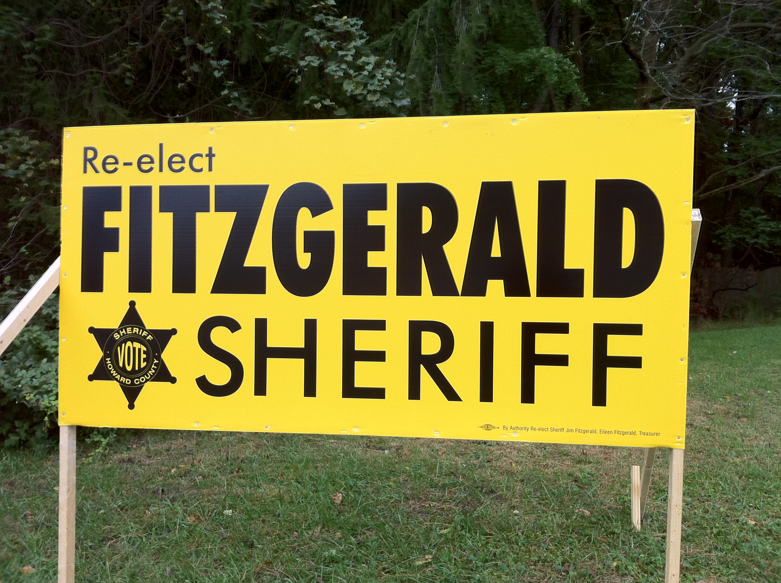
Jim Fitzgerald for Sheriff (2010)
Another example of a bold black on yellow color scheme, this time incorporating a design element to good effect. (Some Fitzgerald signs covered this star with a sticker indicating a police union endorsement.)
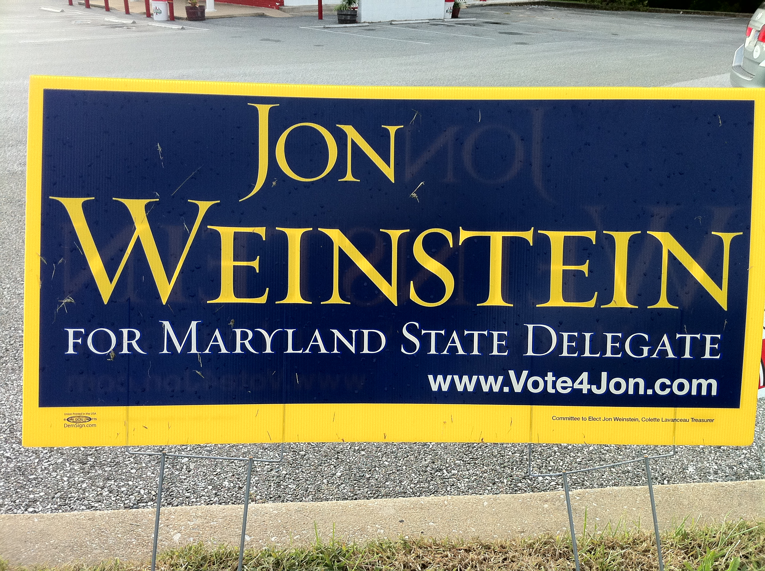
Jon Weinstein for Delegate (2010)
Here yellow serves as the text color. I’m genuinely uncertain as to whether this sign would have been better served by using white as the text color instead: I think white text would have been more readable, but many candidates were using white text on blue in 2010, to the point of it being a cliché.
Maryann Maher for Delegate (2010) (with logo)
I recall driving myself crazy trying to figure out what the logo in the upper right corner was supposed to represent. Other than that it’s a nice sign.
Tune in tomorrow for part 3!