With the primary one day away, I’m close to the end of this campaign sign adventure. Today we look at the signs in the race for Howard County Council in District 1, a seat left open when Courtney Watson decided to run for Howard County Executive. The candidates are Democrats Dave Grabowski, Lisa Markovitz, Wendy Royalty, and Jon Weinstein, and Republicans David Blake Melton and Kevin Forrest Schmidt.
Here are the signs, in alphabetical order by candidate, along with my comments, according to the criteria I’ve previously discussed. Note that I could not find any signs for David Blake Melton.
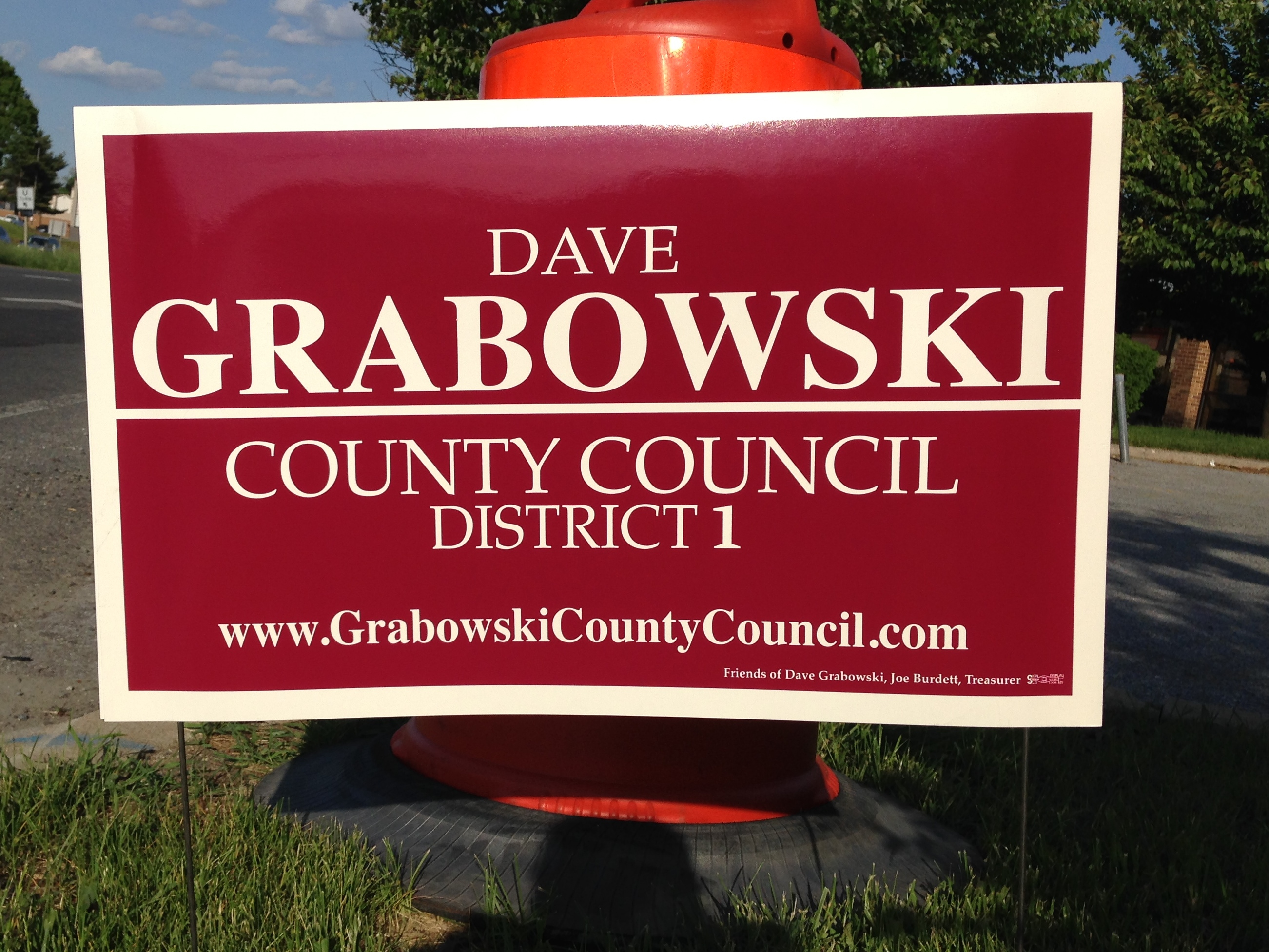
Dave Grabowski, like Lisa Markovitz and Dario Broccolino, has the problem of having a long name that’s difficult to fit on a sign; unlike Renée McGuirk-Spence, hyphenating it is not an option. Unlike the Dario Broccolino sign, which provided more room for the name by displaying it on the diagonal, this Grabowski sign adopts the simple strategy of displaying the name horizontally in a serif typeface that is pretty readable. Overall the sign is clean and well-designed, with no extraneous elements or slogans. The background color isn’t one of my favorites, but that’s just a matter of taste; certainly it provides a good contrast to the text.
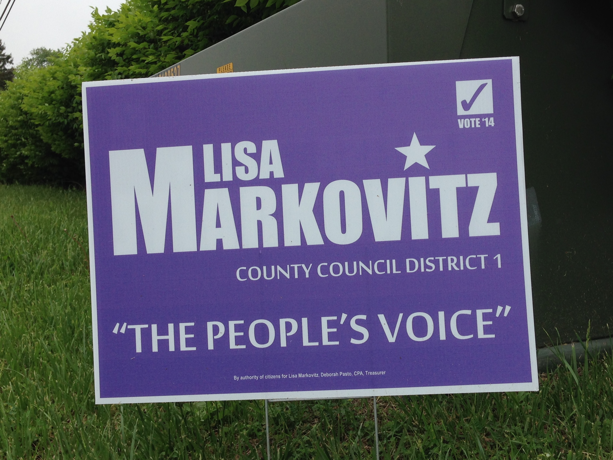
I like the color on this sign; it’s a change from the typical colors and is not so pastel that it causes contrast problems. However I think the typeface used for “Markovitz” is just a tad too bold, and that does affect readability a bit. Compare this sign to the Grabowski sign above; both names are the same length but I think you’d better be able to recognize “Grabowski” from a distance. Also, I’m not sure the “Vote ‘14” design element in the upper right corner adds anything.
This is a solid sign: No extraneous clutter, typeface that’s bold but still readable, and a good background color.
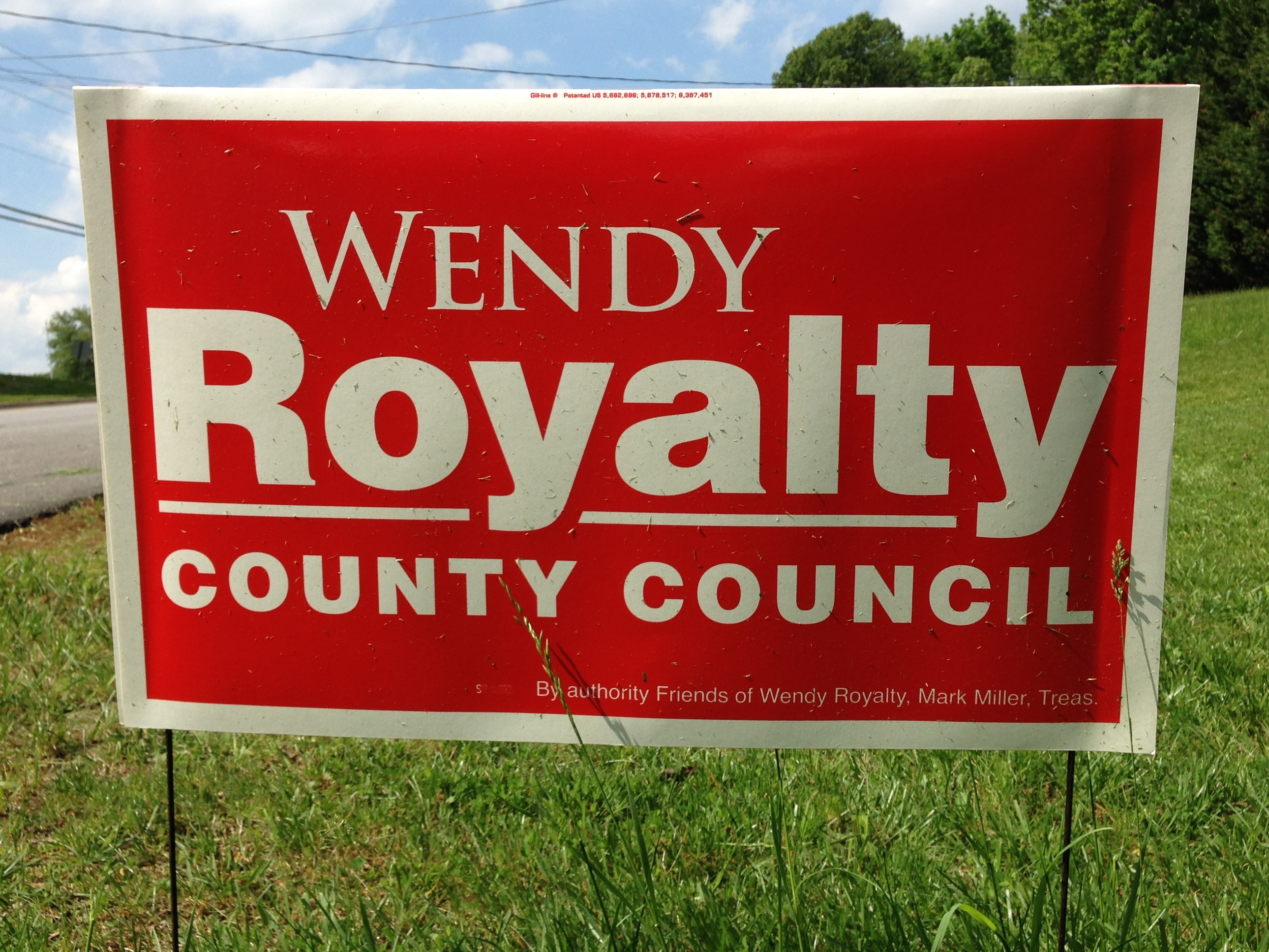
This is almost the same design as the small Wendy Royalty sign, but it’s missing the white border found on that sign. To me that’s to its detriment: I think the white border works well to frame the main part of the design. Without the border all that red in the background gets to be a bit much. The design is cropped really tight as well; notice how close the “R” and “y” in “Royalty” are to the edge of the sign.

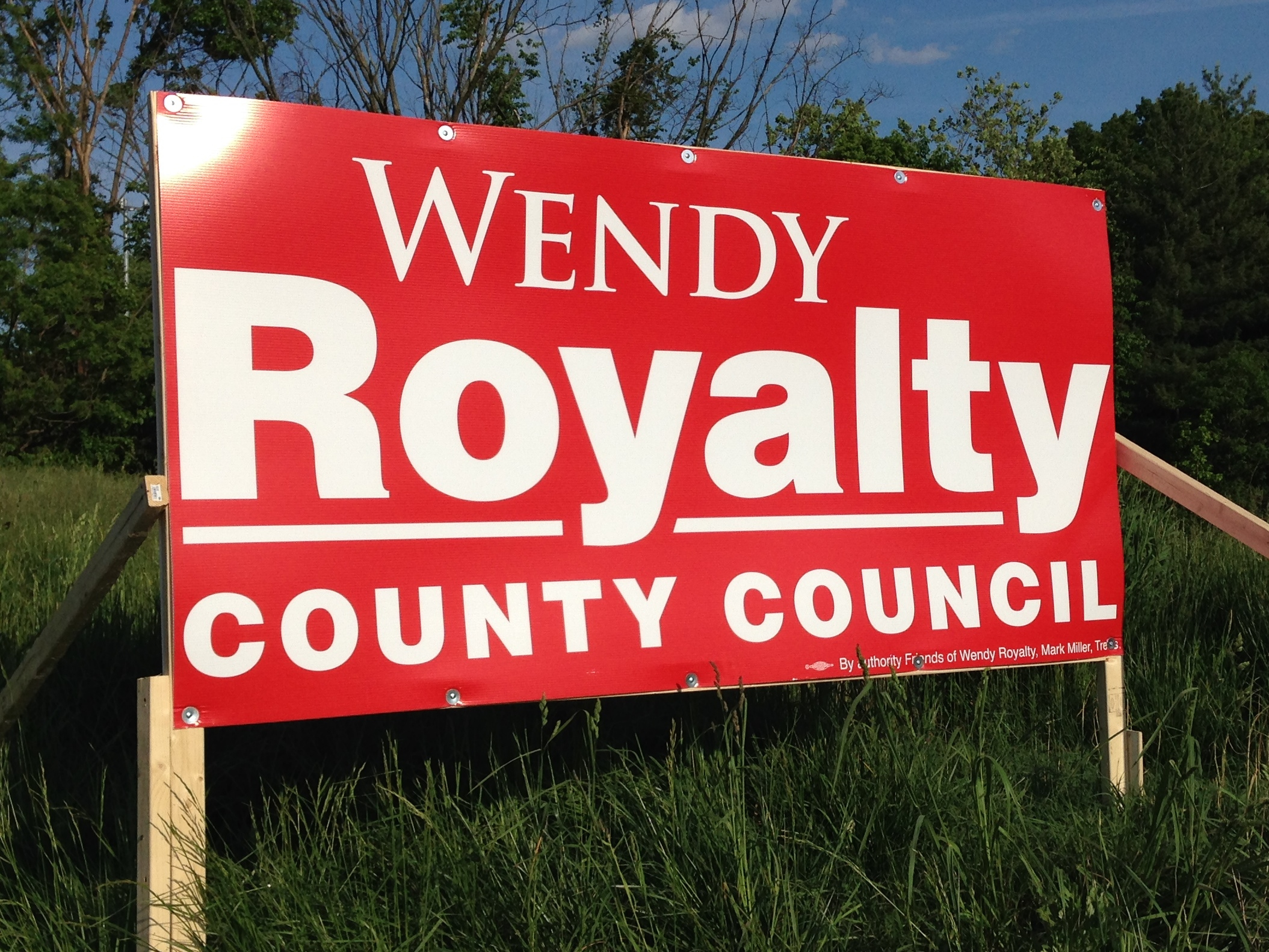
A nice minimal sign that highlights the candidate’s (full) name and position sought without trying to cram anything else in. The color and typeface look good as well.

This is an interesting sign. Kevin Forrest Schmidt couples this sign with his regular sign, for example putting the “RUN FORREST RUN” sign next to or in front of his other sign. It’s a cute gimmick to lend some personality to the signs, although I’m not sure if it’s worth printing double the number of signs that normally would be required.
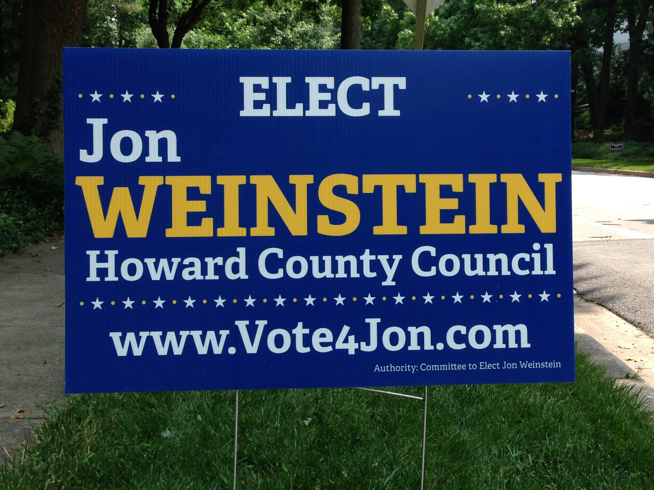
Jon Weinstein likes yellow and white text on blue backgrounds; his 2010 campaign signs used the same color scheme. This one is interesting because it’s a variant of the design on his other small sign. I don’t really like the stars intermixed with dots; it seems a bit busy. However I do like the typefaces on this sign.
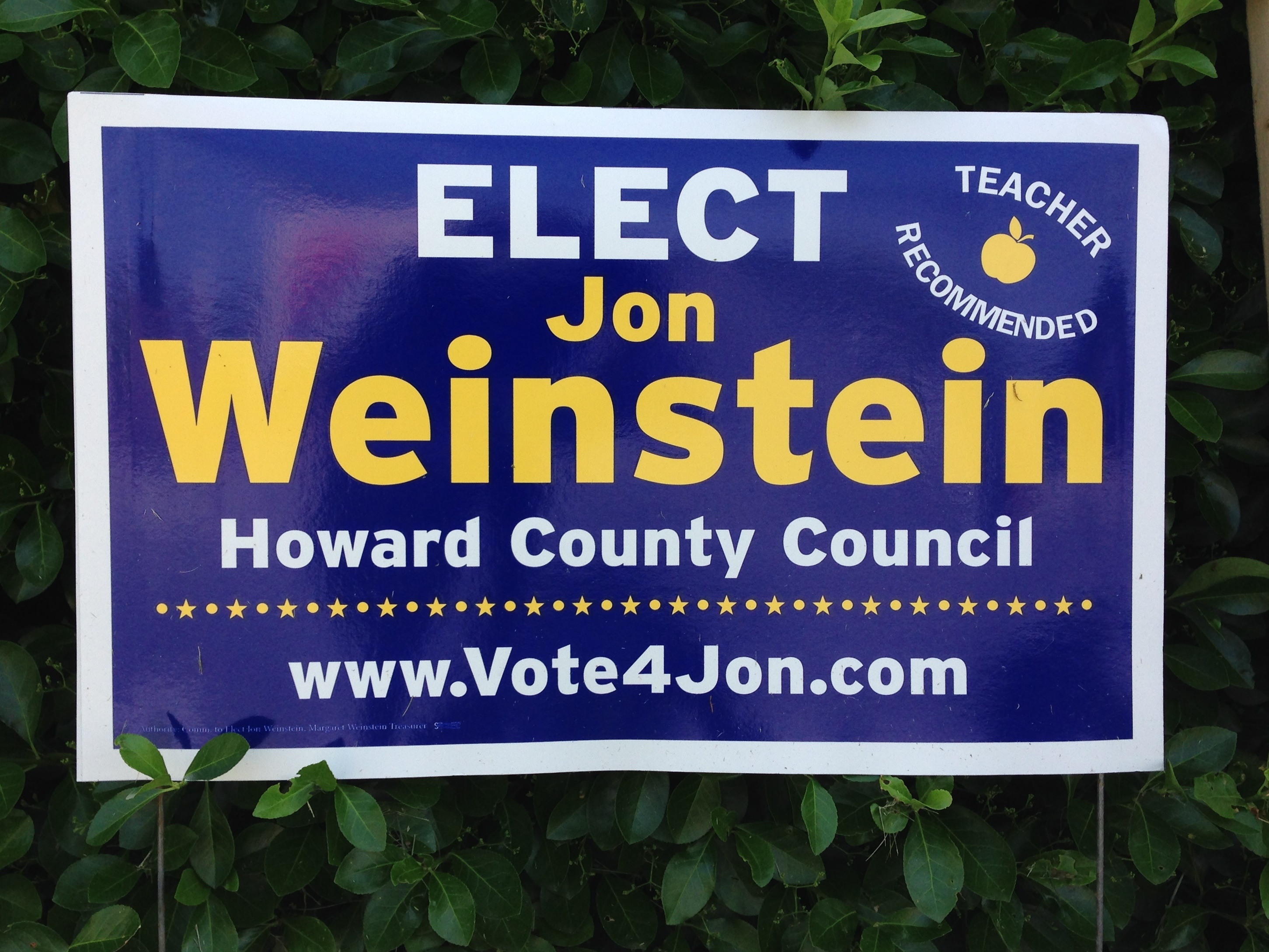
The different typeface and the switch to mixed upper and lower case on “Weinstein” make this sign a bit more legible. However I think the typeface on this sign is a bit lacking in personality compared to the previous sign.
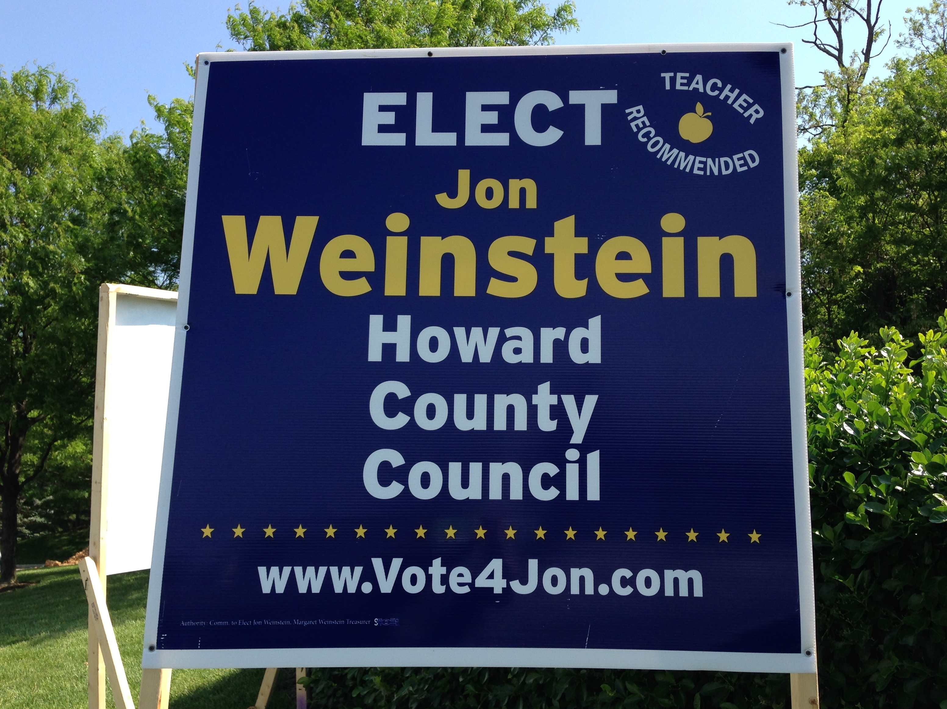
This sign is just a taller version of the small sign, with “Howard County Council” spread out over three lines to add height. I think that’s a mistake, as it makes the design look too skinny. I think it would have been better to drop the “Howard,” put “County Council” on one line, and reduce the height just a tad.
Which sign should go on to the general election? There are no clunkers in this race, but overall I think I like the small Wendy Royalty sign the best. However the large Wendy Royalty sign serves as a warning that a good design can be significantly compromised by seemingly minor changes (in this case removing the border and cropping more tightly).
In my next post I’ll look at the marquee Howard County race, and the last local race for which I was able to find signs, namely the contest for Howard County Executive.