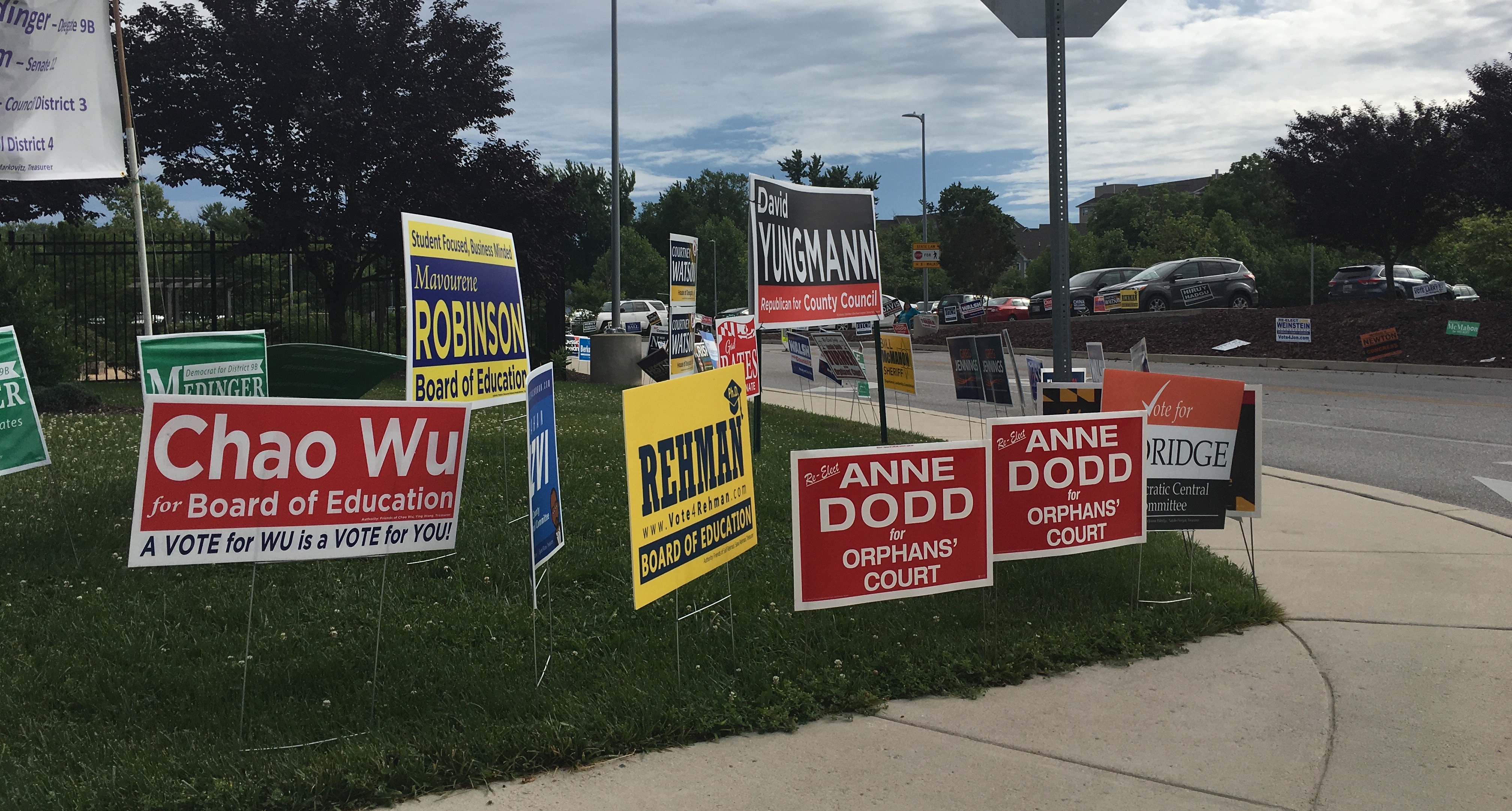
Campaign signs at the entrance to the Miller Branch library. (Click for a higher-resolution version.)
tl;dr: I’m continuing my reviews of 2018 campaign signs in Howard County. This post features signs from Mary Kay Sigaty, Shawn Conley, Sabina Taj, Anne Dodd, Elizabeth Ann Fitch, Saif Rehman, Rich Gibson, Allan Kittleman, David Yungmann, and Chao Wu.
As in the last post I review ten different signs, again in random order. For more on this series see part 1.

Mary Kay Sigaty, Democratic candidate for Maryland House of Delegates, District 12. (Click for a higher-resolution version.)
This sign is put together reasonably well, but it seems a bit busy to me. That’s likely because the Maryland flag (attractive though it may be) is a bit busy visually, and this sign devotes a fair amount of background space to it.
Otherwise the sign is fine. The typography is varied, with the typeface used for “Mary Kay” providing a note of informality. The sign also follows the rules for the four colors of the Maryland flag: match yellow with black (as in the “Mary Kay” and ”Democrat for State Senate” text) and match red with white (as in the “District 12” text), but never juxtapose red with yellow if you can help it.
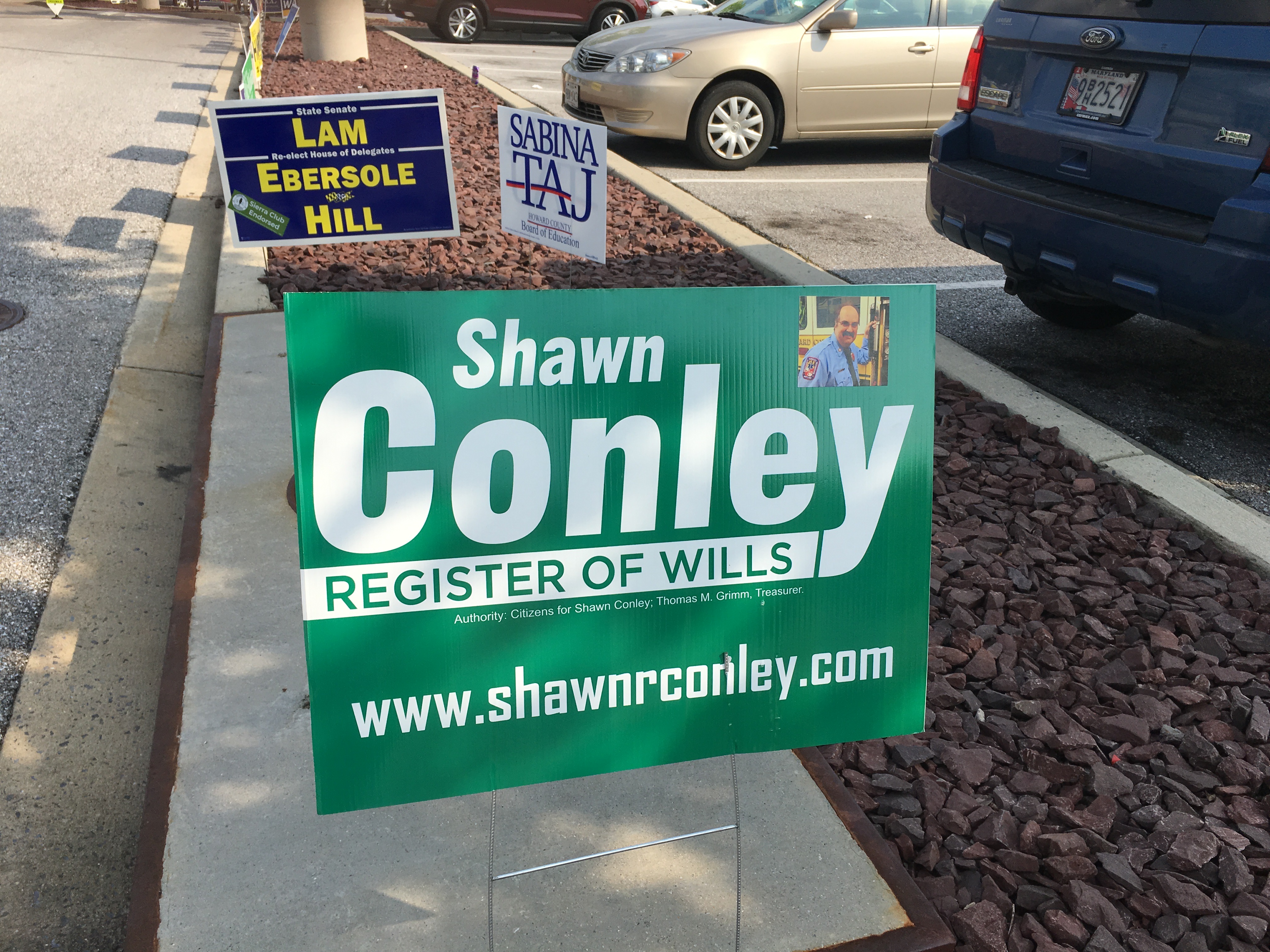
Shawn Conley, Democratic candidate for Howard County Register of Wills. (Click for a higher-resolution version.)
This is sort of a middle-of-the-road sign: it’s legible, prominently features the key information, and has a little bit of a design element in the white stripe joining up with the descender of the “y,” but otherwise there’s not a lot that makes it stand out from the pack.
The one exception is the inclusion of a small photo of the candidate. This must have been intended for people encountering the sign close up, like at a voting location, because this would be almost impossible to make out if you were just driving by.

Sabina Taj, candidate for Howard County Board of Education. (Click for a higher-resolution version.)
The thing that really jumps out at you about this sign is the horizontal slightly wavy stripe that forms the crossbar of the capital “A”. There’s actually a fair bit of subtlety to this element: if you look really closely you can see that there’s a thin black stripe separating the upper blue part of the stripe from the lower red part. I’m not sure exactly why it was included; possibly it’s to avoid directly juxtaposing red and blue, two colors that cause visual issues when seen side-by-side.
The horizontal stripe is echoed by the smaller stripe separating “Howard County” from “Board of Education”. This smaller stripe is also composed of three smaller stripes, red and blue with black between them.
Like Clarence Lam, Sabina Taj is blessed with a three-letter last name that can be displayed at an extremely large size. Her first name isn’t that long either, so it can be shown at a large size as well. In combination with the stripe design element and the high contrast between the dark blue text and the white background the result is a sign that does a very good job of highlighting the candidate’s name.
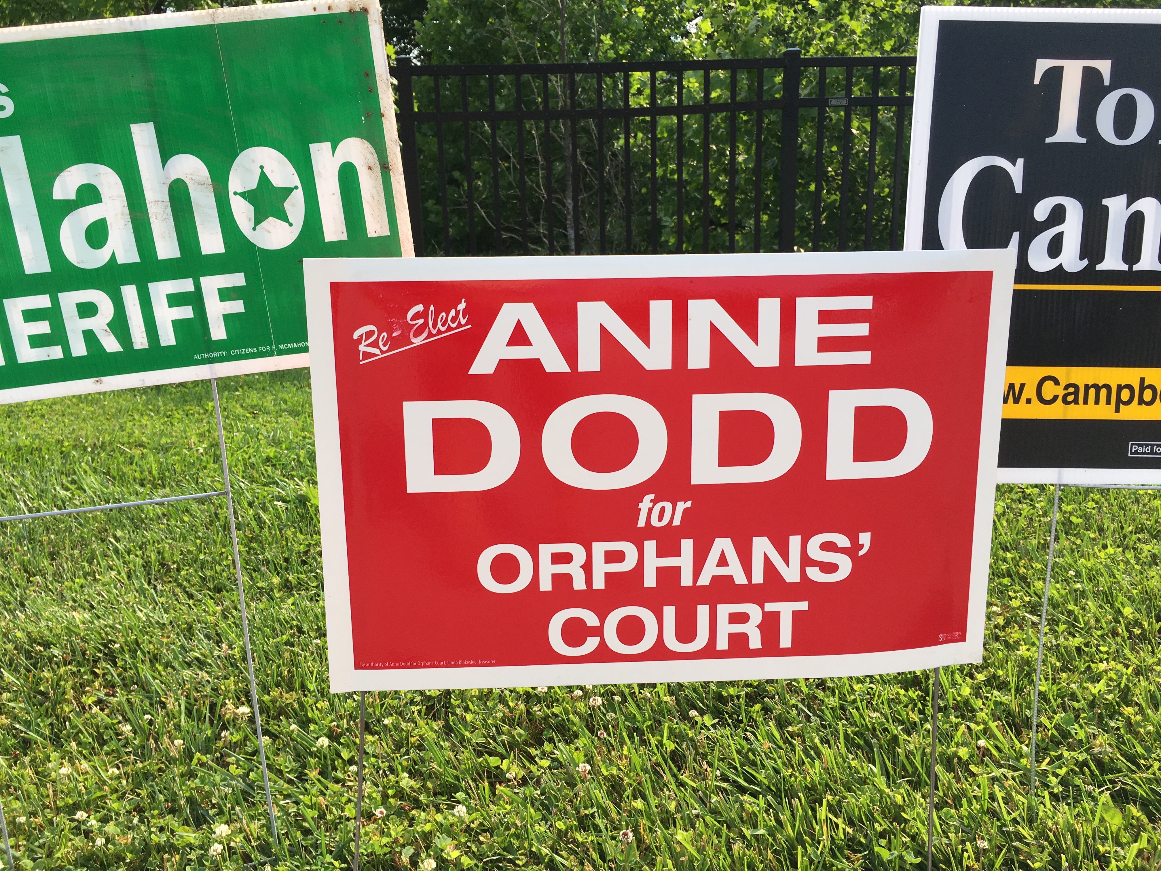
Anne Dodd, Democratic candidate for Judge of the Orphans’ Court. (Click for a higher-resolution version.)
Like other Judge of the Orphans’ Court incumbents, Anne Dodd is reusing the design from her 2014 sign. Here’s what I wrote about it in the last cycle:
This is a good example of a effective minimal sign design: Only as much text as needed, a single and simple sans serif typeface (the “for” appears to be simply in an oblique version of the main typeface), no extraneous design elements, and only a single color other than white. I have only one criticism: When viewed from a distance the “D” and “O” in “DODD” look somewhat similar, so that the name looks like “OOOO” or “DDDD”. A different typeface might have helped this, or alternatively using both upper and lower case (“Dodd” vs. “DODD”).
The only change this time was to add the word “Re-elect” in the upper left corner, similar to what Nicole Bormel Miller did with her sign. This somewhat mars the pure minimalism of the original sign, but overall the sign still looks good.
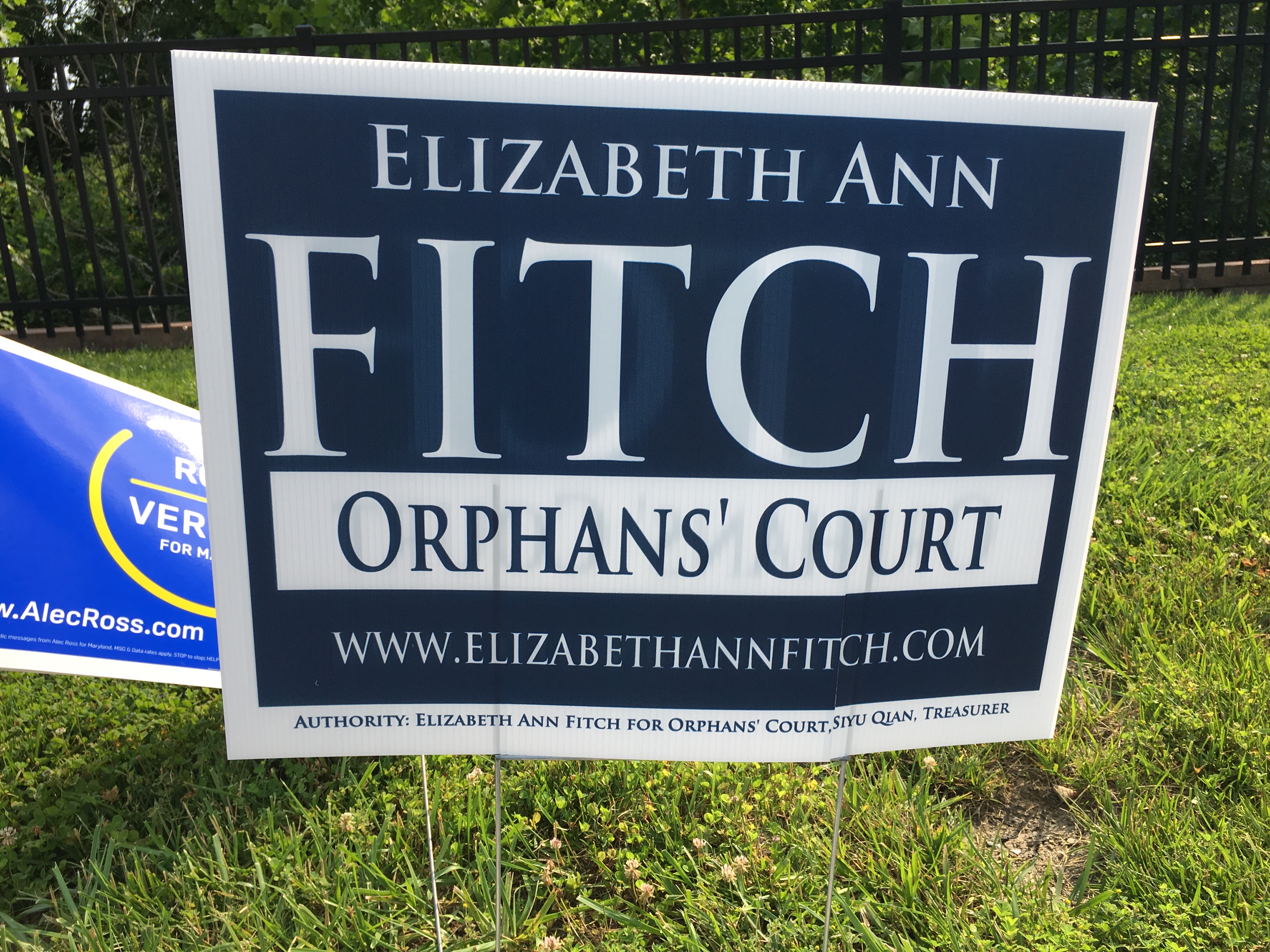
Elizabeth Ann Fitch, Democratic candidate for Judge of the Orphans’ Court. (Click for a higher-resolution version.)
Another Orphans’ Court sign, this one is an interesting case: the color is great, the typeface is elegant and “Fitch” stands out nicely, but to me the white rectangle around “Orphans’ Court” makes the sign look slightly bottom-heavy.
I presume the designer tried just using white text on the same blue background for “Orphans’ Court” and preferred the approach they ultimately took, possibly to make the name of the office stand out a bit more. I’m just a rank amateur, so I’m not going to second-guess their decision.
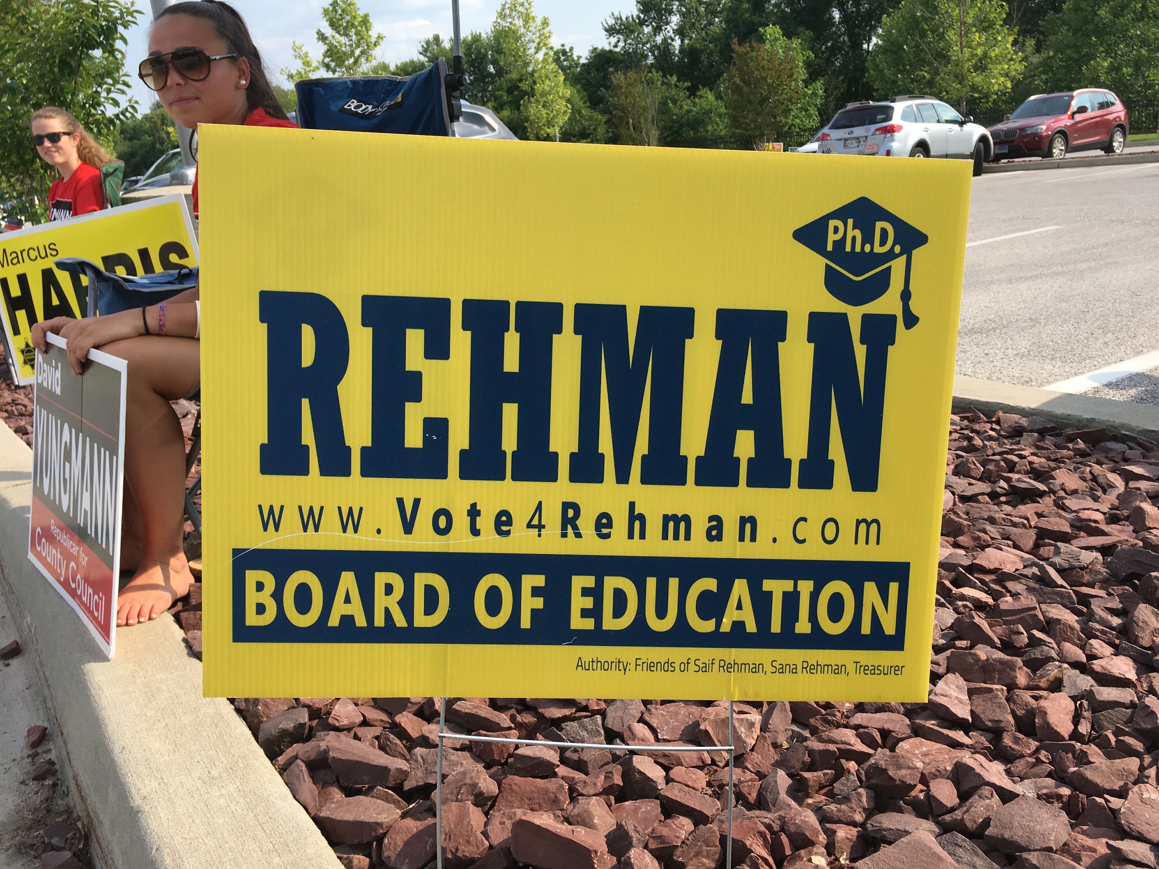
Saif Rehman, candidate for Howard County Board of Education. (Click for a higher-resolution version.)
I will confess to a bias here: I generally don’t like signs that are just black (or in this case, what appears to be almost dark blue) text on an overall yellow background. I just don’t think it’s an attractive color combination, especially when those are the only two colors on the sign. I’ll try to put away that bias a bit for the moment, but even taking a more neutral attitude this sign doesn’t really stand out too much.
One thing I wonder about is whether the designer contemplated putting the candidate’s first name in the upper left. There’s plenty of room for it, and it would have balanced out the “Ph.D.” mortarboard in the upper right. As it is the empty space causes the sign to look a bit bottom heavy.
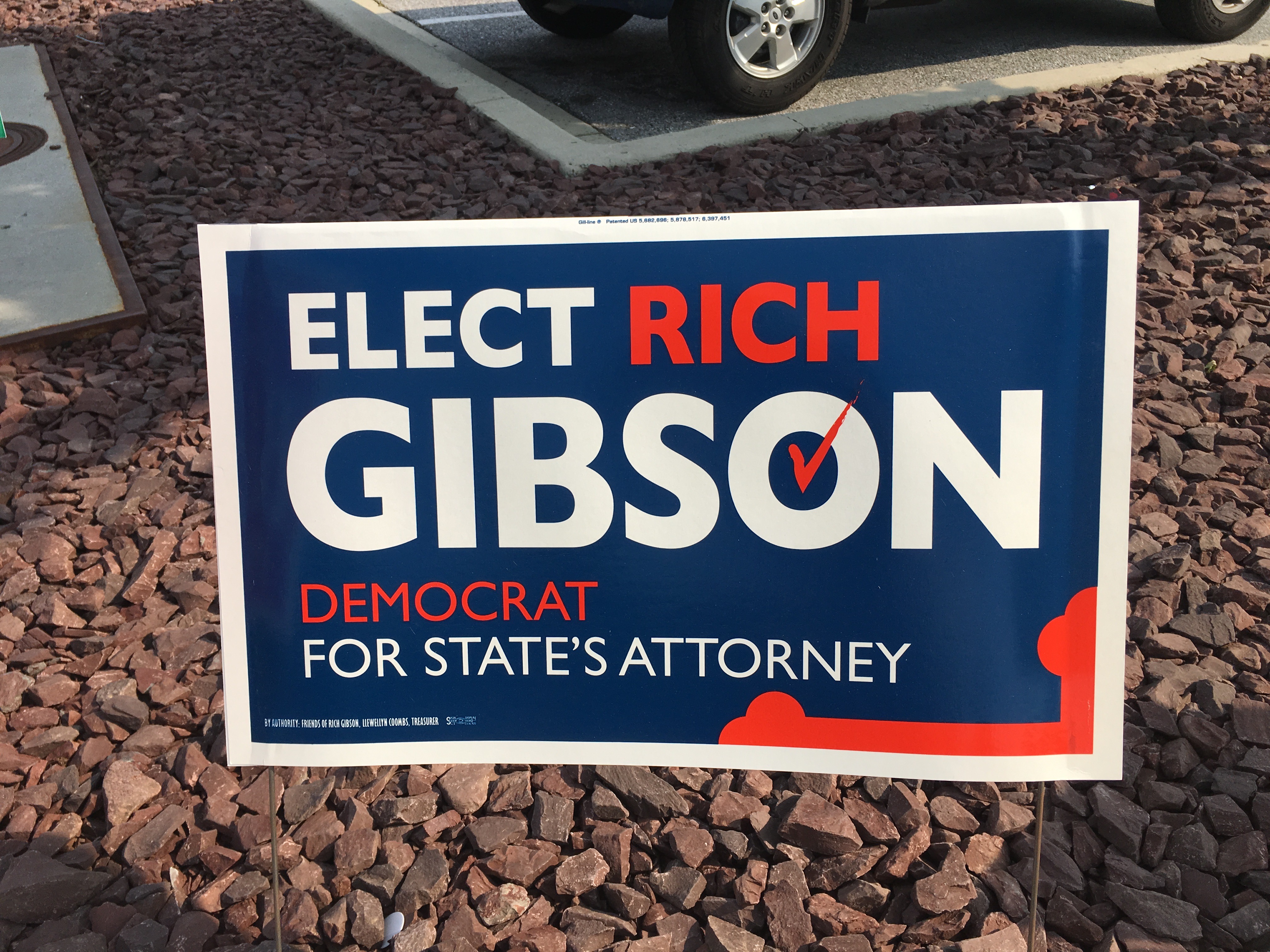
Rich Gibson, Democratic candidate for Howard County State’s Attorney. (Click for a higher-resolution version.)
For some reason people running for State’s Attorney have a track record of producing excellent campaign signs: I thought Dario Broccolino’s 2014 sign was the overall best of that election cycle, and Kim Oldham’s sign in this cycle stands out as well.
Rich Gibson’s 2014 sign was no slouch either, but his new sign is even better in all respects: the 2014 black and orange colors have been upgraded to a deep blue and a brighter orange. All text is now in the same sans serif typeface, with some text in orange for visual contrast. (Note that it’s less important text: the candidate’s last name and office sought are still in white for maximum impact.)
The Howard County map design element has been replaced with two more effective elements, an orange checkmark that lends visual interest to “Gibson” and an element in the lower right corner that evokes the Maryland flag. (In case you’re interested, the official name for that part of the flag is a “cross bottony.”)
All in all this is a very good-looking sign that also checks all the boxes for what you want to see in a campaign sign.

Allan Kittleman, Republican candidate for Howard County Executive. (Click for a higher-resolution version.)
As far as I can tell this is almost but not quite the same sign Allan Kittleman used in his 2014 race for Howard County Executive. The main change appears to be a change in aspect ratio: relative to the 2014 sign that I reviewed the current sign is wider, so that the letters appear to be less narrow than on the previous sign. (This doesn’t apply to the red banner though, which appears to have kept its previous width and now takes up a bit less of the total width of the sign.)
The old sign also had the website name in the lower right. It was removed from the new sign—probably a good idea, since it was small, hard to read, and detracted from the overall design.
Since the 2014 sign was a pretty good sign and Kittleman won that race, I presume he decided to stick with a winning formula. I’ll do the same, and just quote part of what I wrote last time:
I’ve previously written about the problems inherent in using all four colors of the Maryland flag in a single sign. This sign handles those problems as well as they can be handled, mainly by avoiding the red text on yellow background found in signs from Trent Kittleman, Frank Mirabile, and others. Instead this sign carefully restricts itself to the exact color juxtapositions found the Maryland flag: black with yellow, and red with white. More specifically, it restricts itself to what I think are the best color combinations: black text on a yellow background and white text on a red background.
Some other things to note about this sign: The typeface is clean and readable; it’s bold enough to stand out but light enough to allow adequate space between the letters. Using both upper and lower case in “Kittleman” means that the text isn’t quite as wide as it would be if it were in all upper case, and thus it can fit better on the sign. . . .
The red banner-like design element in the upper right corner is well-done; note that on the left side of the element the yellow background seems to form an arrowhead pointing to the “Proven Independent Leader” slogan. The slogan itself points diagonally upward to the right to make the sign more dynamic (the same technique used on the Dario Broccolino sign). Finally, note that the horizontal line separating “Kittleman” from “Howard County Executive” is not just red on yellow (a poor combination) but is both red and white in order to maintain the preferred color juxtapositions I mentioned above.
The one thing that bothered me about this sign is that the “Howard County Executive” seems a bit thin. When I was walking around the neighborhood I had some trouble making that text out when viewing the sign from a distance.
The increased width of the 2018 sign doesn’t help readability of the “Howard County Executive” text, since it’s now stretched out a bit further.
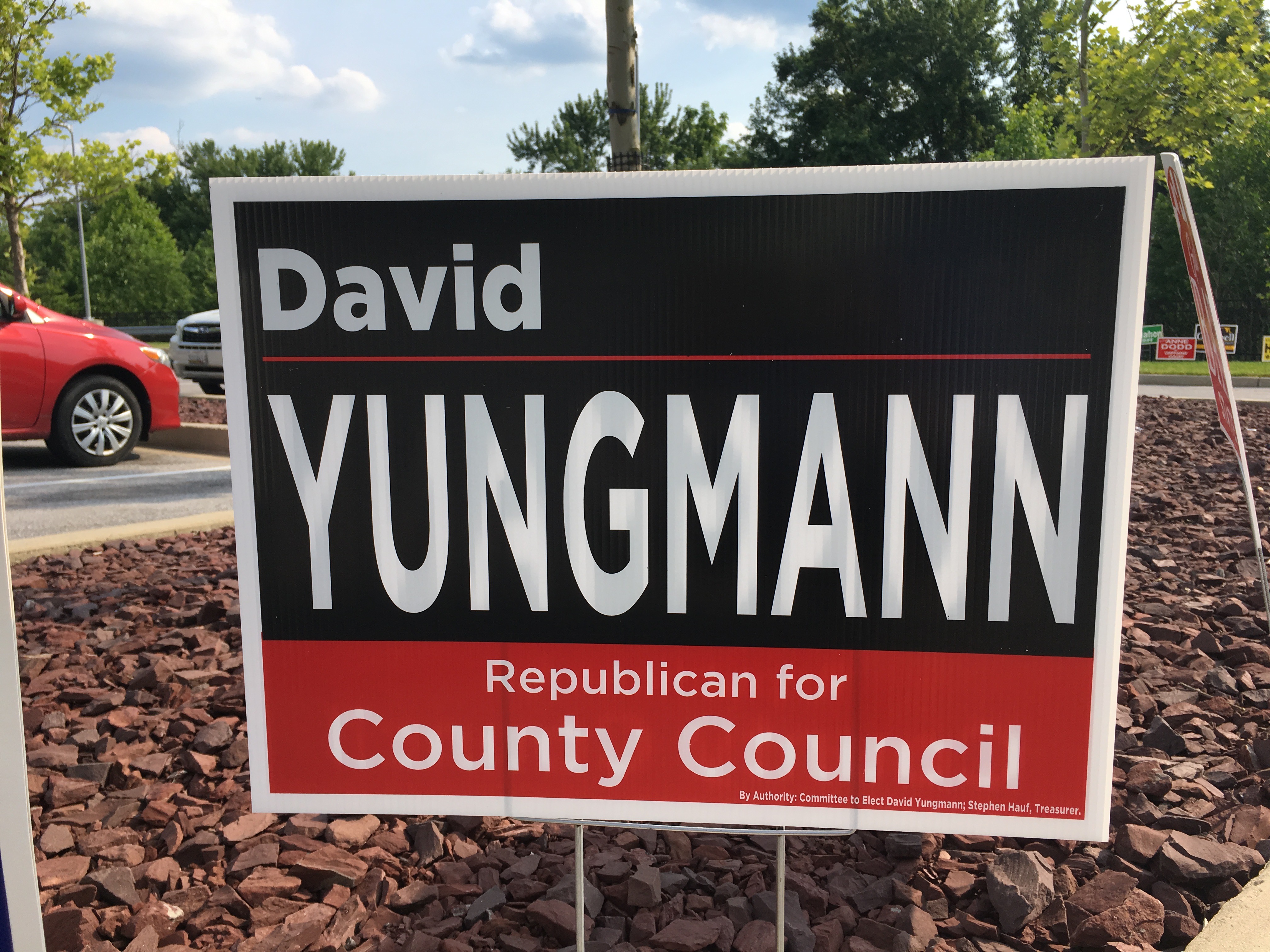
David Yungmann, Republican candidate for Howard County Council, District 5. (Click for a higher-resolution version.)
The color scheme on this sign is very reminiscent of the colors on Warren Miller’s 2014 sign: a very dark blue/black combined with a red that’s bright but not garish. I thought that was a very effective combination on Miller’s sign, and it looks good here too. The major difference is that this sign has blue/black on the top and red on the bottom, reversing the colors from Miller’s sign. For the record, I prefer red on top; I think having red on the bottom makes the sign look a bit top-heavy.
The most significant issue with this sign is not the fault of the designer. Rather it’s that “Yungmann” is a relatively long name, and to fit it within the vertical area allotted to it requires making the letters relatively tall and narrow. This is turn makes the name look horizontally squished and impairs readability somewhat.
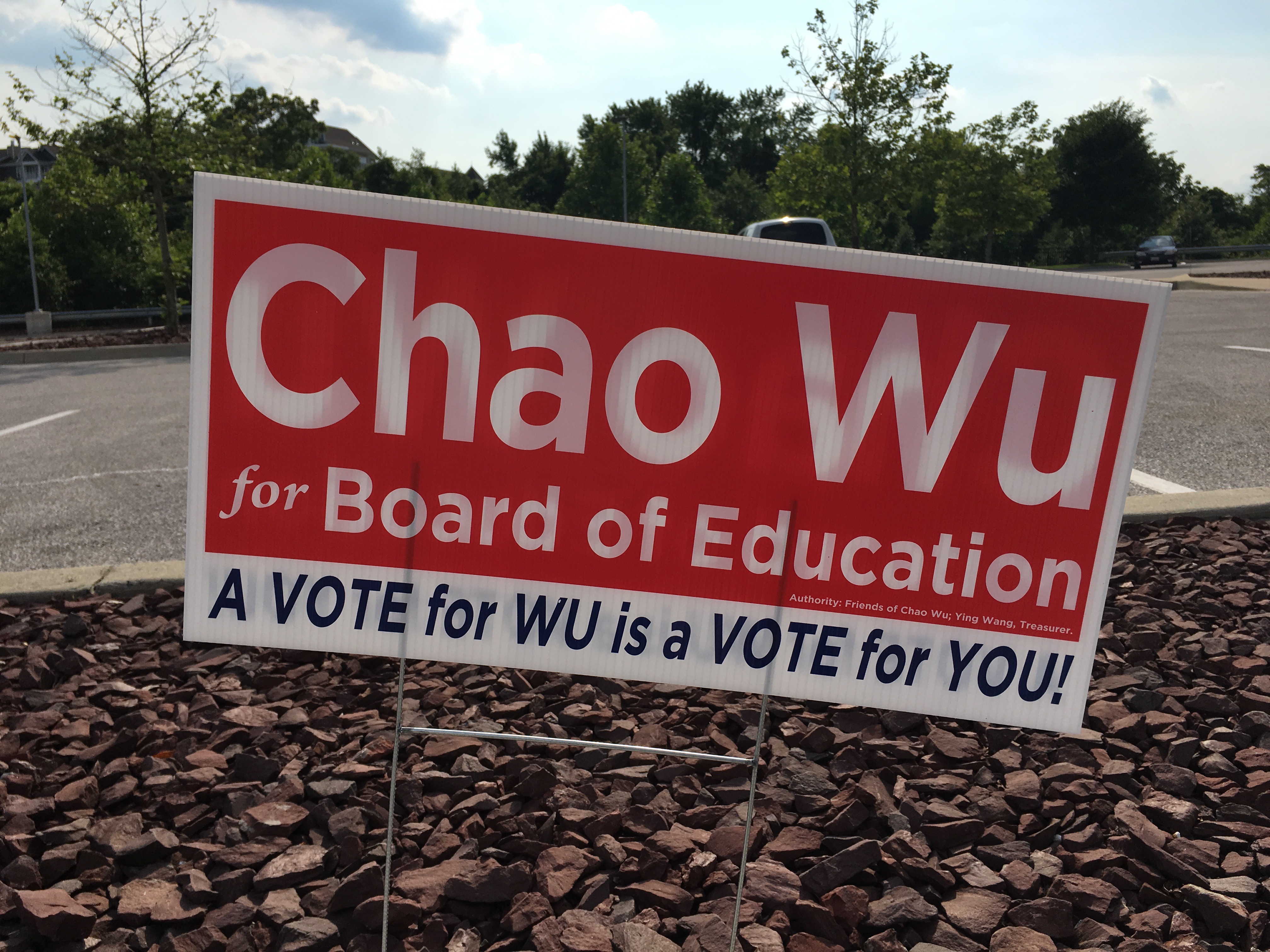
Chao Wu, candidate for Howard County Board of Education. (Click for a higher-resolution version.)
In the last cycle Clarence Lam had the shortest last name of any candidate, and Lam’s 2014 sign took full advantage of that fact to make the candidate’s last name as prominent as possible. In this cycle Chao Wu goes Lam one better with a two-letter family name.
However, rather than having “Wu” totally take over the design, his sign exploits the fact that Wu’s given name is also short, so that the entire name can fit comfortably in one line and still be large enough to have good readability and high impact. It also use mixed upper and lower case for the name, which I think was a good decision: besides improving readability somewhat, it also helps ensure that voters don’t misinterpret “Chao Wu” as a single undifferentiated family name “CHAOWU.”
As far as other aspects, though Chao Wu is running for a nonpartisan position and I have no idea of his party affiliation he’s an independent, the sign color scheme looks very similar to is reminiscent of that used by Republicans David Yungmann and Warren Miller, with a deep blue/black and bright red. The major difference is that the blue/black is used for the text, not the background. I wonder what the sign would have looked like with the slogan in white text on a blue/black background (which would have matched Warren Miller’s sign); I suspect it would not have worked as well but have not tried this out in an image editor.
All in all this is a good sign, readable for the important bits (name and position sought) and with straightforward attractive colors and typeface. My only concern is with the slogan: I think it’s OK to have a slogan because the sign has only three lines, but it seems just a tad cluttered compared to the rest of the sign.
39 signs reviewed thus far, at least 18 to go—perhaps more if I can
find signs for a few candidates who didn’t have signs at the Miller Branch early voting location. Check Twitter and Facebook for the next article, and don’t forget to vote for the best sign of those discussed in this article.
UPDATE: Voting is closed. See part 7 for all the signs that advanced to the final round.