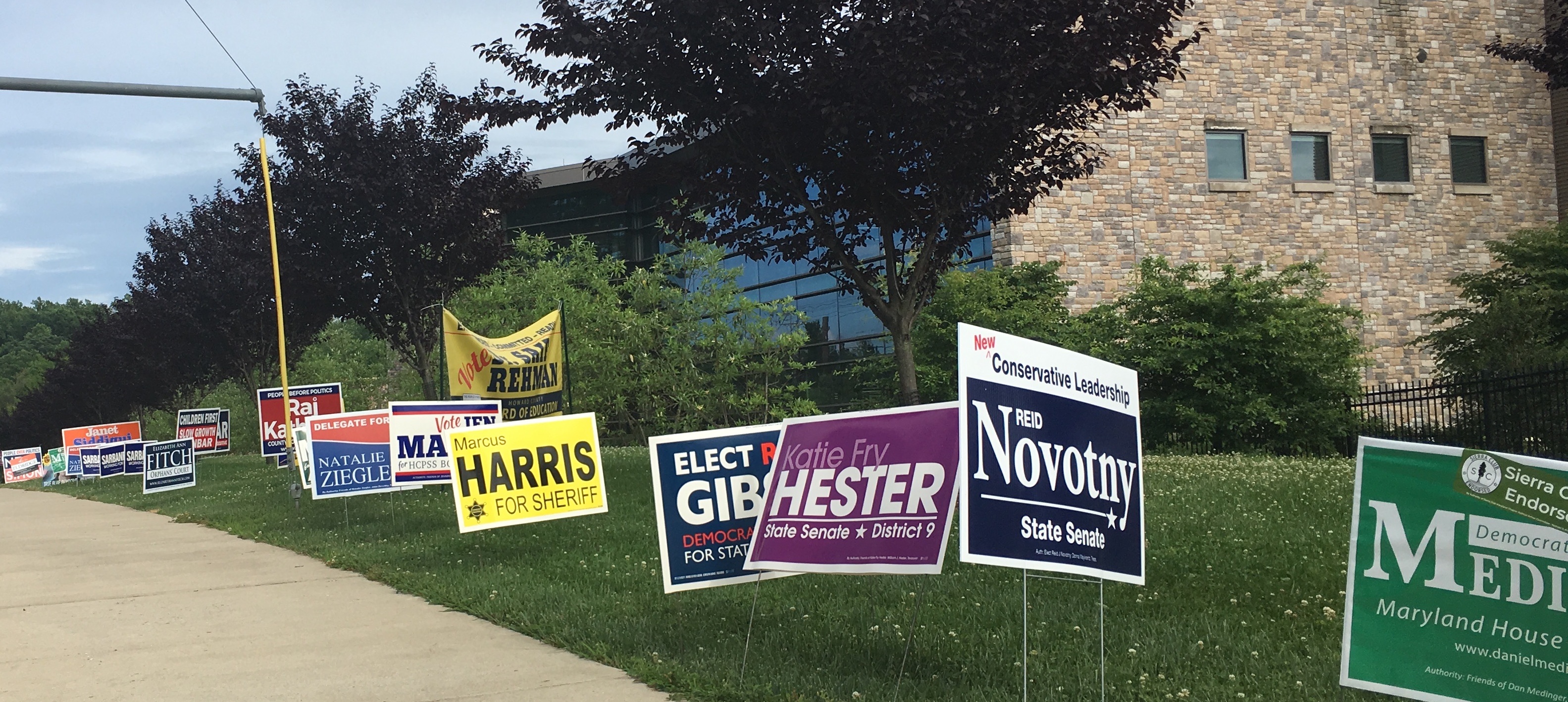
2018 campaign signs on Frederick Road next to the Miller Branch library. (Click for a higher-resolution version.)
tl;dr: Here’s my final set of reviews of Howard County 2018 campaign signs. This post features signs from Opel Jones, Steven Bolen, Bill McMahon, China Williams, Wayne Robey, Byron Macfarlane, Gail Bates, Katie Fry Hester, and Robert Miller.
Today I have only nine signs to review. Every post thus far has included only signs that I saw at the Miller Branch library during early voting. This post includes one other sign, for Wayne Robey, that I saw in my own neighborhood.
There are a number of other candidates who did not have signs at the Miller Branch library or other places I’ve looked. Typically these are candidates who are not actively campaigning or have no opposition in the primary and will post signs later. I don’t plan on doing an update of this series for the general election, so signs for this latter group of candidates will go unreviewed this year.
As always, the signs are listed in random order, there’s a survey link at the end, and you can find more background at part 1.
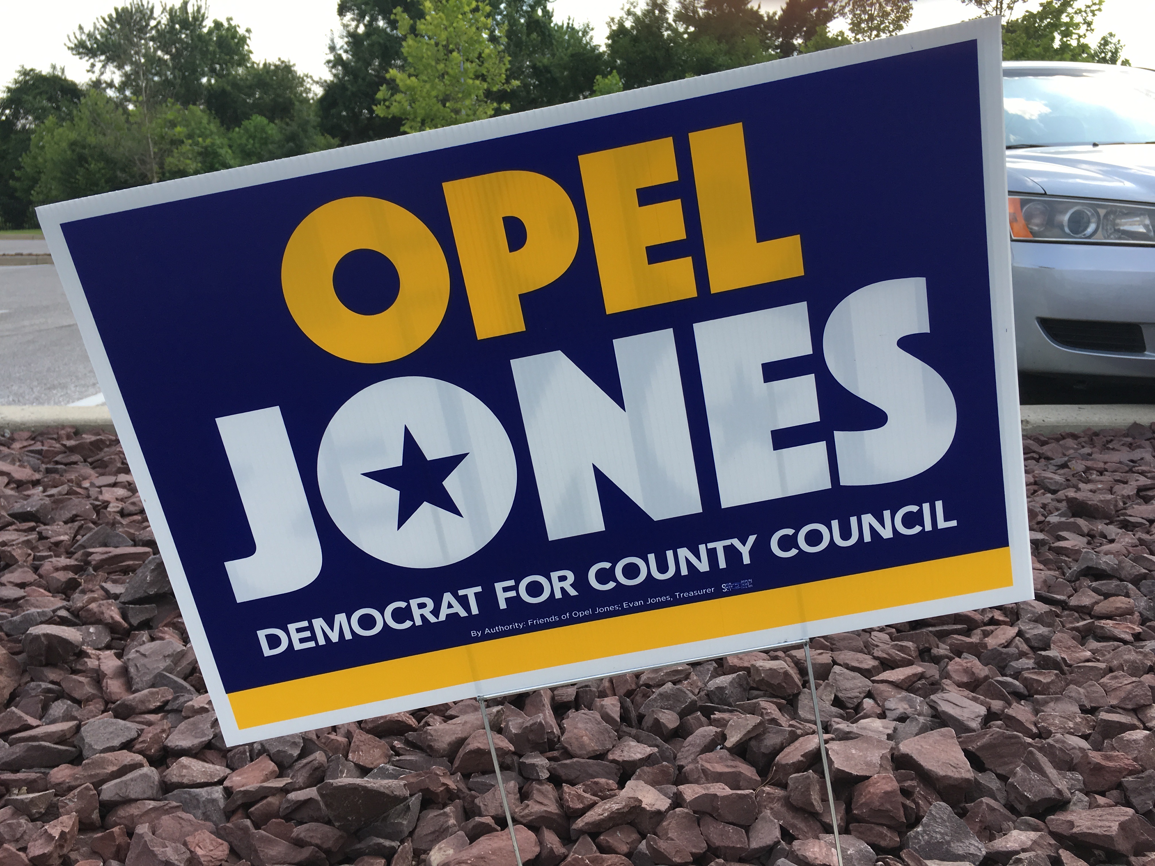
Opel Jones, Democratic candidate for Howard County Council, District 2. (Click for a higher-resolution version.)
This is a good simple sign that has multiple strategies to avoid being boring. First, the star in the middle of the letter “o“ in “Jones” lends visual interest to the text and breaks up the all caps single typeface nature of it. Second, the use of a second color highlights “Opel” just as the star did for “Jones”. Finally, the yellow strip at the bottom echoes the color of “Opel” and underlines the sign as a whole.
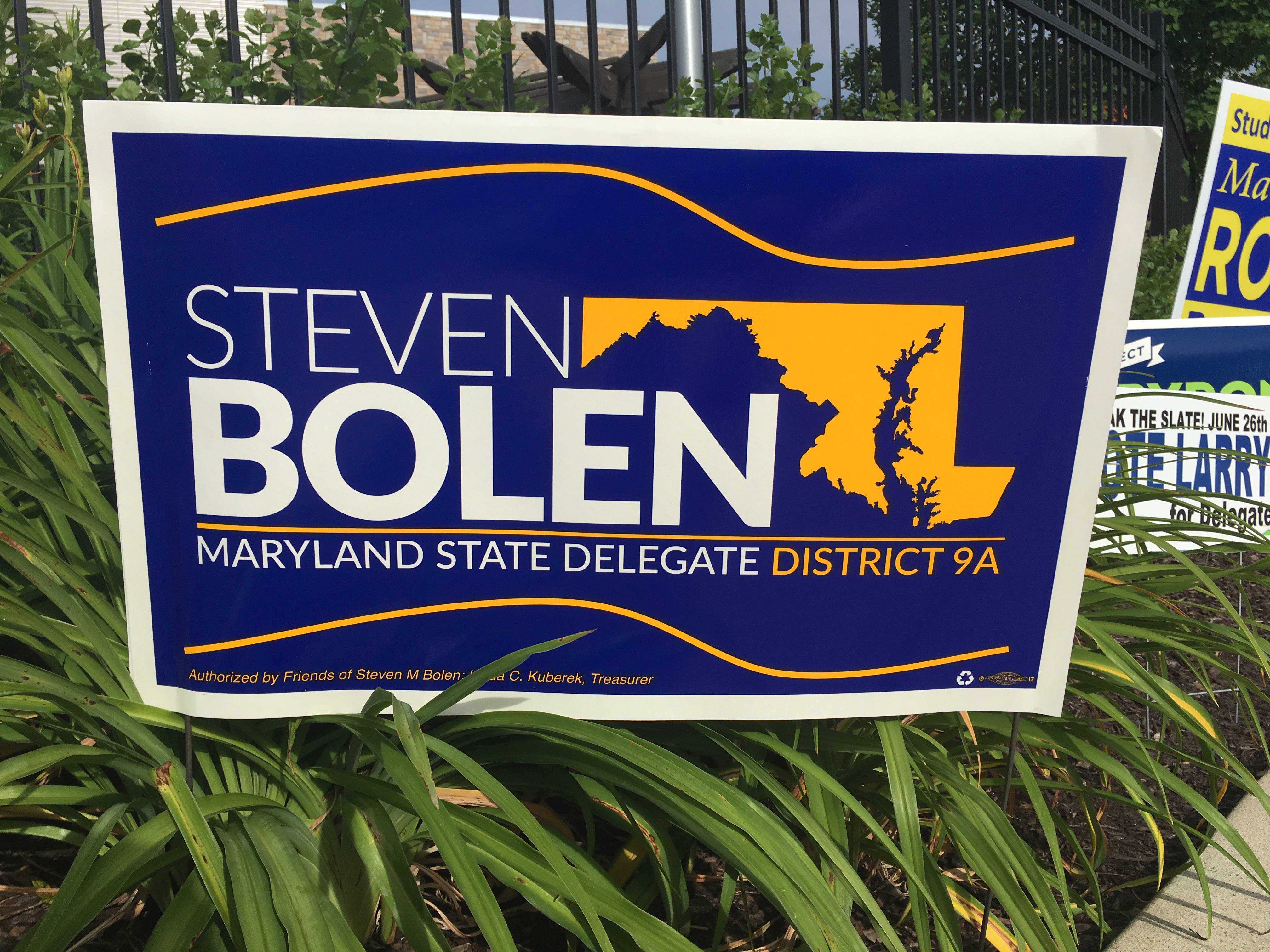
Steven Bolen, Democratic candidate for Maryland House of Delegates, District 9A. (Click for a higher-resolution version.)
Of all the signs I’ve seen that try to use a map of Maryland as a design element, this is the only one where I think it works. Maryland has a strange asymmetrical shape, so it’s difficult to fit into a design. The secret here is to use the northern and eastern boundaries of Maryland to complete the rectangle of which “Steven” and “Bolen” form the left and bottom sides.
The other parts of the sign work well too: the brownish orange and blue match well, the text looks clean and readable, and it’s a nice touch to have the color of “District 9A” match the color of the Maryland map.
The only things I’m not 100% on board with are the wavy lines that evoke the shape of a fluttering flag. They’re OK as a way to fill the space above and below the main sign content, and I really can’t imagine a good alternative, but for some reason they didn’t totally win me over.
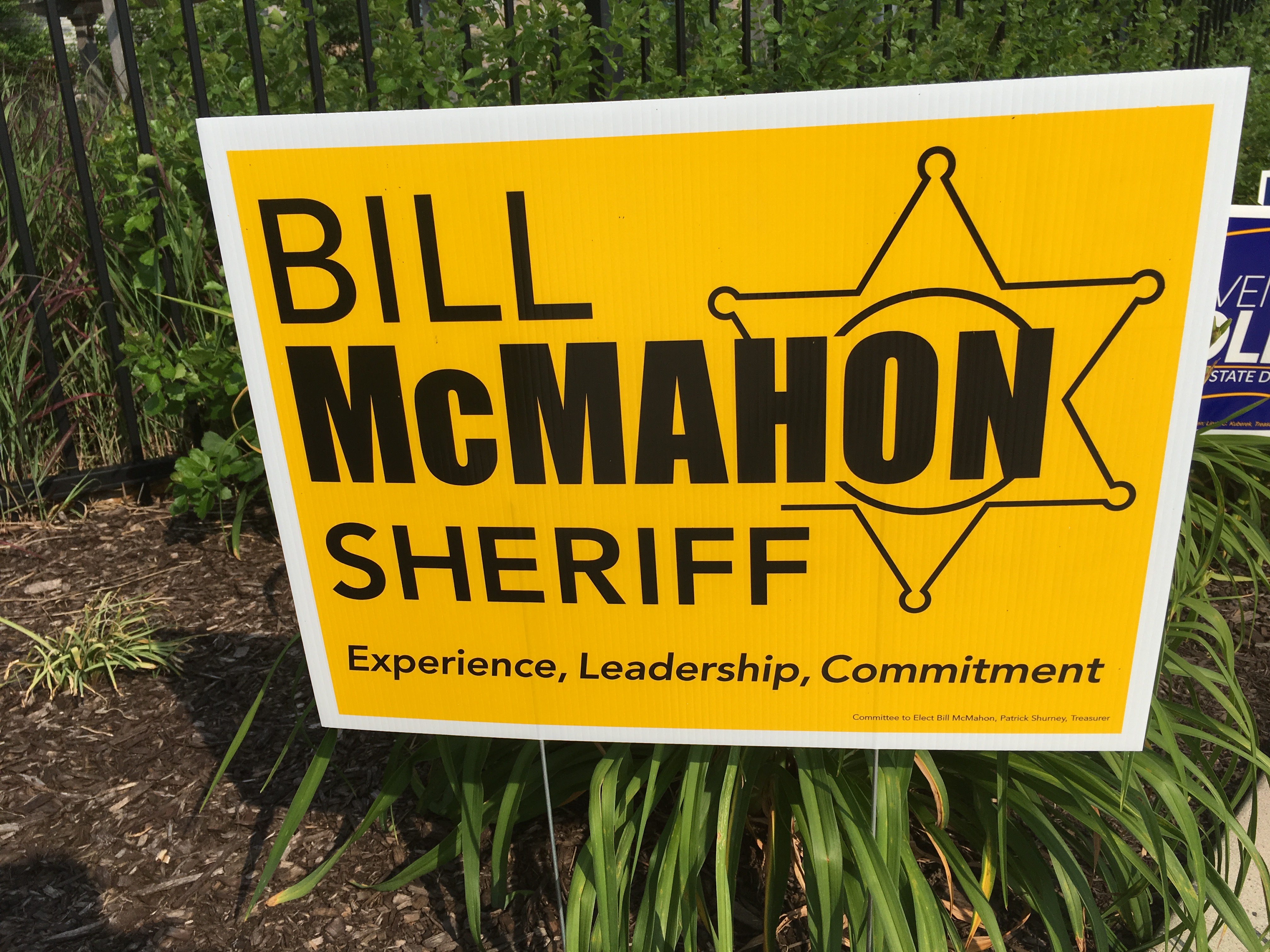
Bill McMahon, Republican candidate for Howard County Sheriff. (Click for a higher-resolution version.)
As I mentioned in my last post, for some reason candidates for Howard County Sheriff are fond of the black on yellow color scheme: Jim Fitzgerald used this color scheme in 2014, and Marcus Harris is also using it this year.
This is a reasonably good example of the type: readable, with good emphasis on the name “McMahon,” and a sheriff’s-badge design element that doesn’t over-complicate the design. It has a slogan, but it’s nice and crisp.
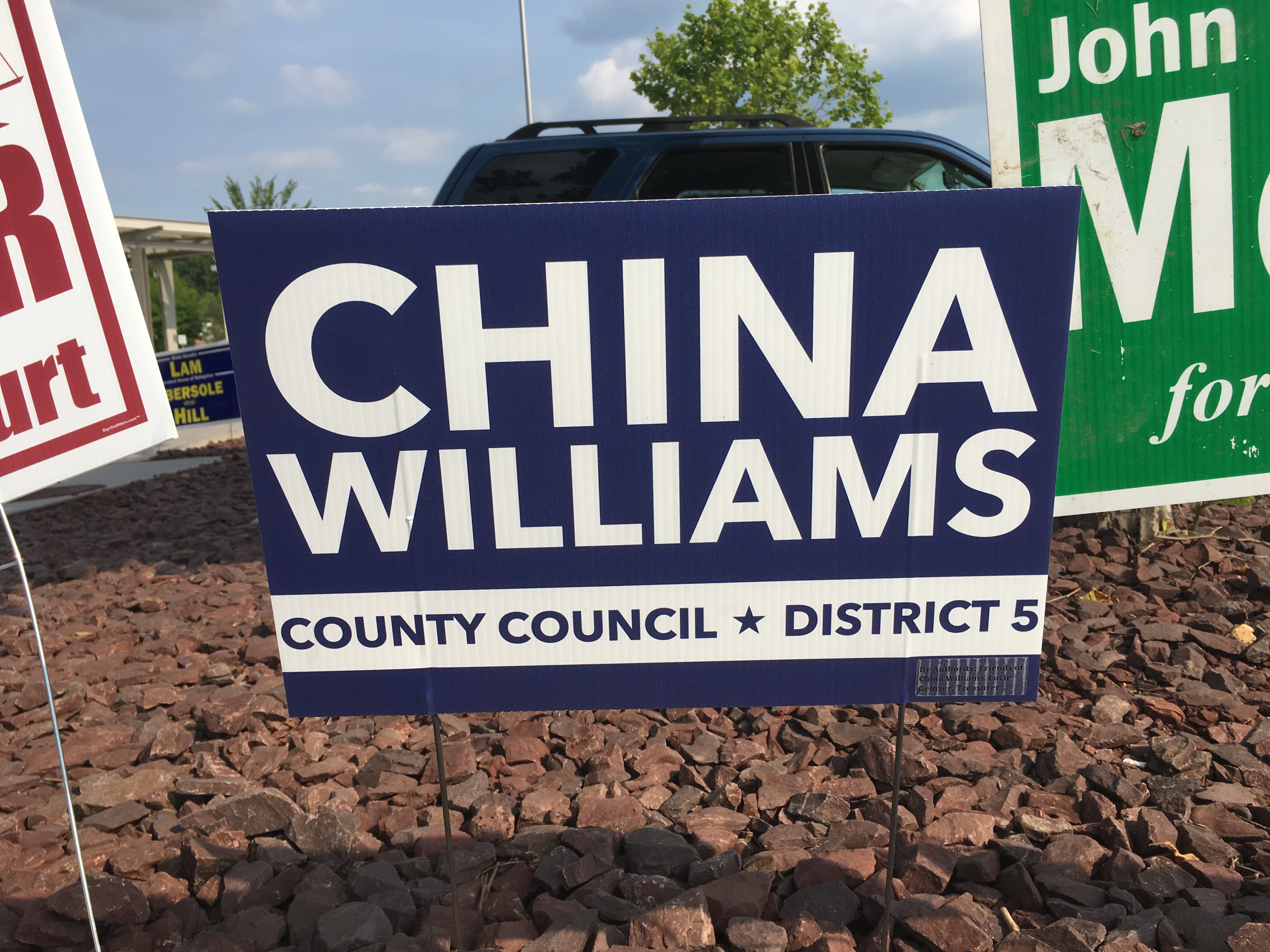
China Williams, Democratic candidate for Howard County Council, District 5. (Click for a higher-resolution version.)
A good minimal high-contrast sign that provides the key information needed by voters. It’s worth noting that “China” is almost twice as large as “Williams”. This is partly dictated by the last name being significantly longer, and thus less tall when both names occupy the width of the sign. However it also makes sense from a name recognition perspective, since “China” is more memorable than “Williams.”
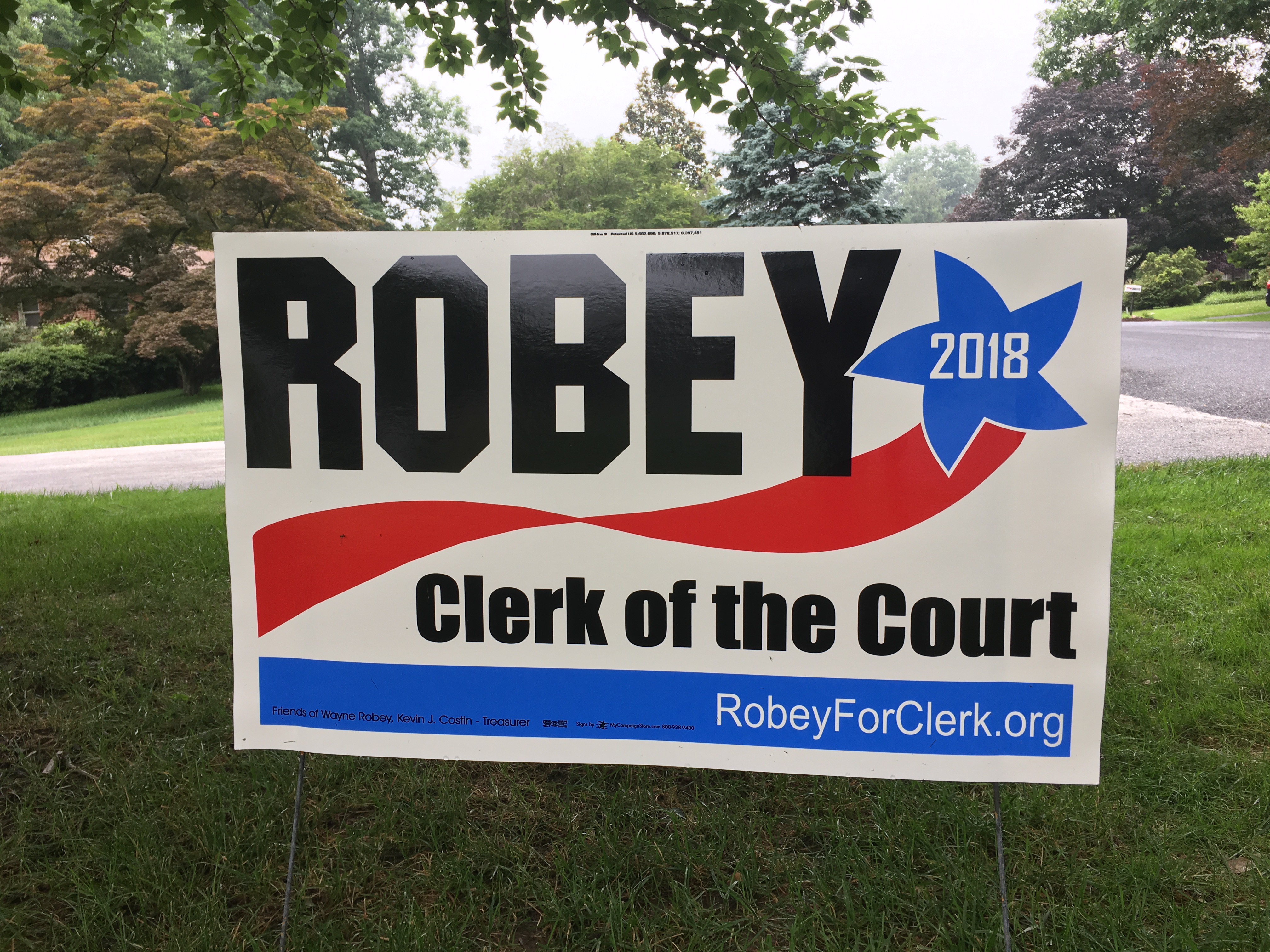
Wayne Robey, Democratic candidate for Howard County Clerk of the Circuit Court. (Click for a higher-resolution version.)
This is a good example of using red, white, and blue together: the red ribbon and blue star design elements together give a bright and even playful air to the sign that makes it more attractive.
The black text also provides good contrast with the white background. However I’m not really sure why such a blocky and angular typeface was chosen for “Robey”. It looks a bit strange, especially since the red and blue design elements are curved.
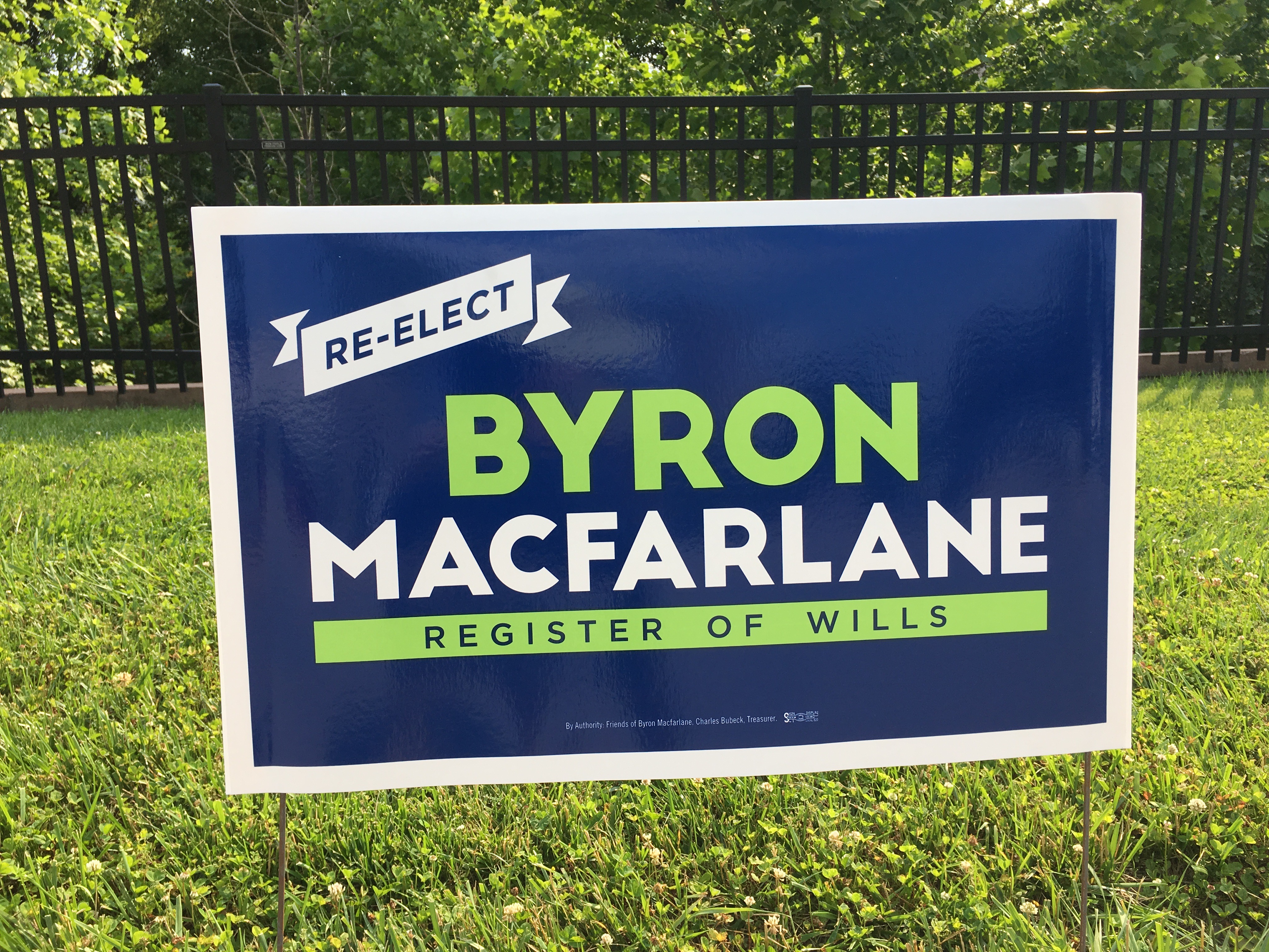
Byron Macfarlane, Democratic candidate for Howard County Register of Wills. (Click for a higher-resolution version.)
Byron Macfarlane has a record of good-looking signs, and this one is in that tradition: legible and minimal text, clean and bold typography, attractive colors that go well together, and a jaunty design element in the upper left. Note that it follows the same strategy as several other signs of contrasting alternating lines of white and colored text throughout the sign.
Also note that “Byron” is set in a slight larger size than “Macfarlane,” even though it really doesn’t need to be (since “Byron” isn’t intended to take up the full width of the sign. However making “Byron” larger provides better visual balance against both “Macfarlane” and the design element in the upper left. It also has the side effect of implying the candidate is a familar presence and on a first-name basis with his constituents after two terms in office.
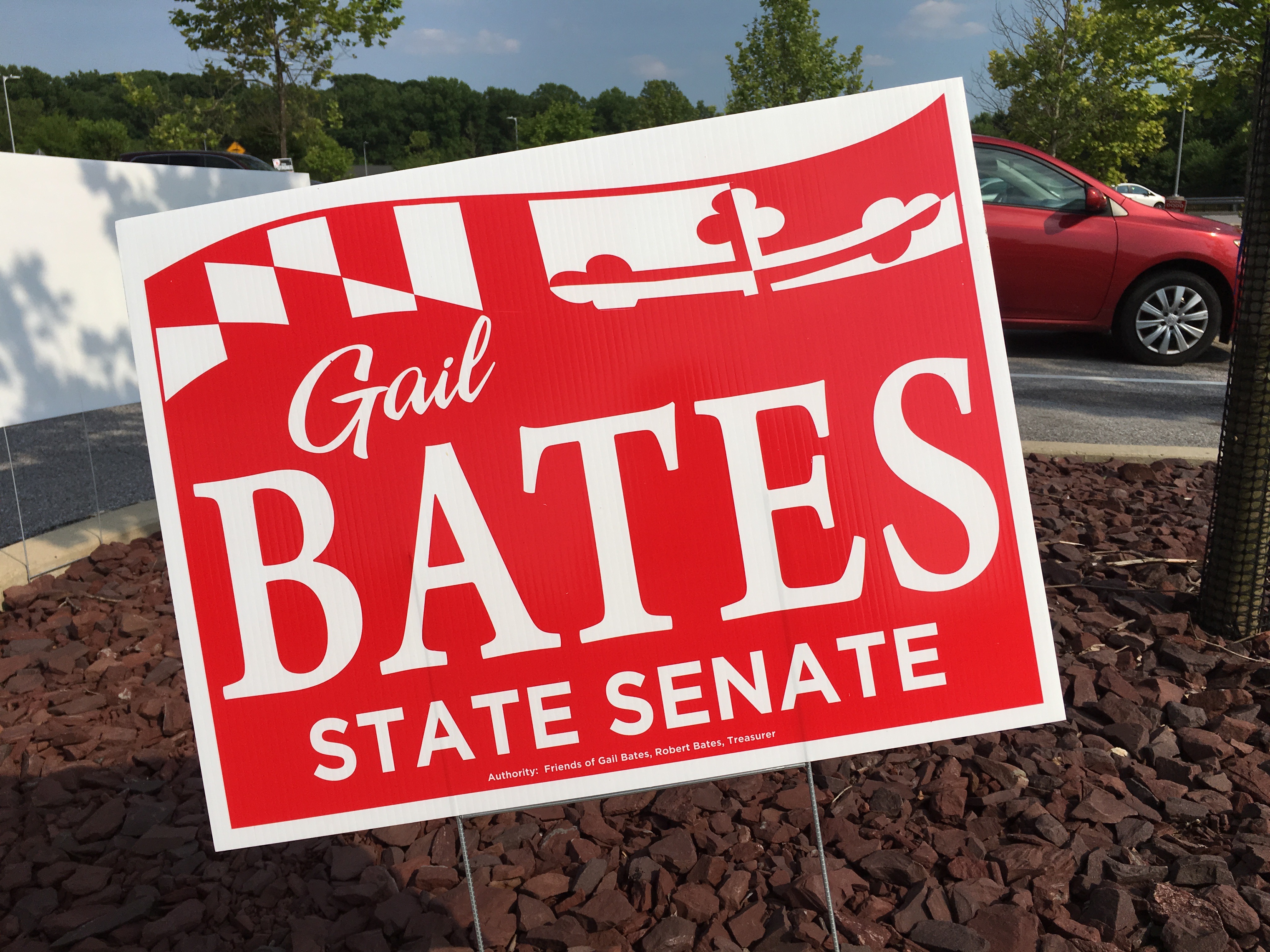
Gail Bates, Republican candidate for Maryland State Senate, District 9. (Click for a higher-resolution version.)
This sign is almost but not quite identical to the sign that Gail Bates used in 2014. The only change I can discern is that the new sign omits the word “For” in “For State Senate”—probably because this year Bates is an incumbent.
Because I’m getting tired I’ll just quote my comments from 2014:
This is a good sign, especially for using only two colors. The “BATES” is large and readable in a clear serif typeface, and the smaller “Gail” in a script typeface adds a nice informal, almost personal, note. The integration of the Maryland flag-inspired banner is also done very well; note that the banner is outlined to prevent confusion between the sign background and the white parts of the banner.
(The outline I was referring to is the one on top of the banner where it meets the border of the sign.)

Katie Fry Hester, Democratic candidate for Maryland State Senate, District 9. (Click for a higher-resolution version.)
This particular example of the sign is marred (in my opinion) by the endorsement logos, but the sign underneath is pretty good. I like the colors, with the light purple of “Katie Fry” contrasting well with the dark purple background and the white text of “Hester”. Setting “Katie Fry” right above “Hester” with almost no linespacing also provides a little visual interest where the descender of the “y” intrudes just a bit on the “T.”
Unlike the China Williams sign above with “China” featured prominently, this sign puts much more emphasis on the last name “Hester”. Here the situation is reversed: “Hester” is a more unusual name than “Katie,” and so it makes sense to make it the focus of the sign and to relegate “Katie Fry” to a secondary role.

Robert Miller, candidate for Howard County Board of Education. (Click for a higher-resolution version.)
I’m not sure if the greenish-gray background color on this sign was intended to evoke a blackboard or not. In any case, while I’m not a big fan of that particular color it does provide a good contrast with the white text. The text itself is clear and readable.
As I’ve previously mentioned, I’m not a fan of putting endorsement logos on signs. The color of the two “Teacher Recommended” logos here clashes somewhat with the background color, and the logos look a bit strange perched on the “shoulders” of “Miller.”
However the design element I’m more concerned about is the steering wheel at the middle of the bottom white stripe. Someone down my street has this sign in their yard, and I must have passed it dozens of times. I also saw it at even closer range when I went to vote. However it was not until I actually looked closely at the sign when reviewing it that I finally figured out that the thing at the bottom was a steering wheel, and I was able to connect it with the “Learning driven” slogan.
In the interest of a simpler design and not confusing people looking at the sign, I think it might have been better to leave the steering wheel off and just include the slogan. Alternately the design could be revamped entirely to make the steering wheel bigger and make it a more integral part of the design.
And with that I conclude my reviews, after discussing 58 signs in all. Please vote for the best sign of those discussed in this article.
UPDATE: Voting is closed. See part 7 for all the signs that advanced to the final round.
A special bonus: tomorrow (Primary Tuesday) please check Twitter and Facebook for your opportunity to vote for the best of the best. I will create one final survey with the winners of each day’s vote and (if appropriate) a “wild card” entry I feel deserves inclusion, and will do a final post on Wednesday with the top three vote-getters.